What can we learn from the Tesla website?
Posted on April 6, 2016 by Jay Jones
Did you know that pre-orders of the Model 3 hit a quarter of a million in 36 hours?
We have all been on our favourite manufacturer’s website using the custom build application trying to see the ridiculous price it would cost with all the accessories attached, only to get halfway through and it to crash or not load correctly.
Cheap UX and tacky copycat websites are a constant pain in the automotive world, so what makes Tesla stand out and manage so many orders?
Let dive in and see. what can we learn from the Tesla website?
Excessive statements
You cannot help but get an Apple vibe with the design and simplicity of the site, none of the crazy bold statements and “unparalleled” features but let’s be honest, they’re all the same….
Look at Mercedes, BMW and Audi below:
- A masterpiece of intelligence (Mercedes).
- The centre of attention wherever it goes (BMW).
- Vorsprung durch Technik – Advancement through technology (Audi)
Tesla are really just down to earth with their headings and their content, they see it from the common person perspective answering the needs of real people, not the imaginary world other brands live on:
- Built around the driver.
- Seating for seven + gear.
- Autopilot – Automatic steering, speed, lane changing and parking
- Everything fits.
Homepage – Tesla’s roots as a tech brand
One of the key reasons Tesla has been so effective as down to producing and perfecting one model, not loads. (now expanded to three models).
This undoubtedly cool vibe taps more into the success of tech products such as anything by Apple.
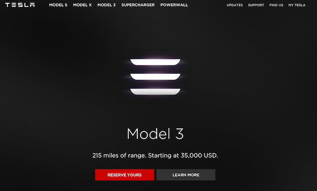
The homepage with the model 3 pre-order is simple, straight to the point and lays the techy law down, just an option to reserve or learn more, oh the suspense is intolerable.
For all we know it could be a long running April fools prank or even selling SaaS?
I think it’s the only “learn more” button I would ever click freely…
Tesla product pages – Simple. Proven Outstanding.
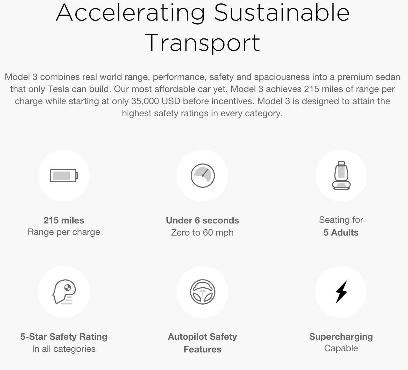
The pages showcasing the Model S and Model X are different leagues of their own.
Conforming a slightly more to an automotive sales page with action packed specs and plenty of engrossing videos/images to make the buyers mouth water.
They use a lot of incentive marketing techniques with their audience and when you create a need in a product they will come by the droves.
Many critics talk about the lack of personality with any car manufacturer website.
This happens when people are excluded from marketing, it caters for the worldwide audience, not the individual personal persona Tesla goes for.
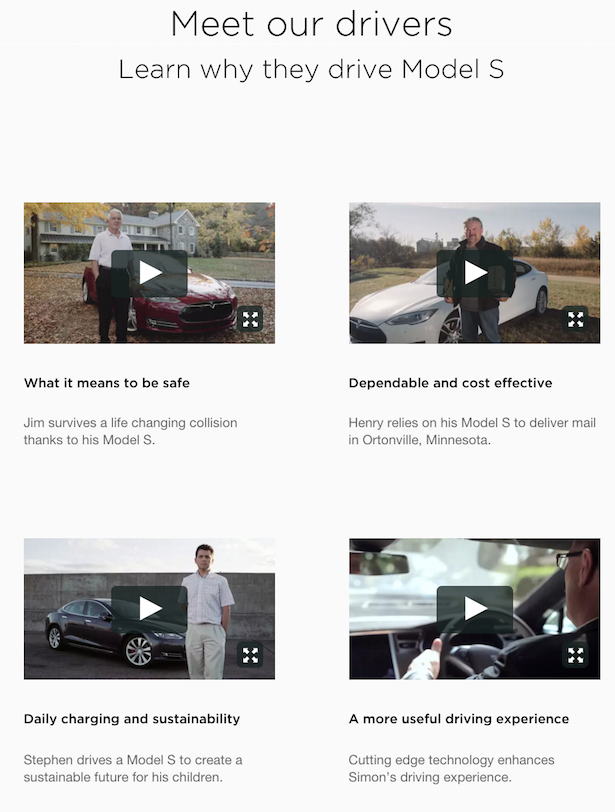
Video testimonials from “genuine” buyers are a really effective method of selling, the fact they also come from very varied backgrounds showcases the possibilities of what Tesla can do- safety, efficiency, sustainability and driving experience.
Cross-referenced content
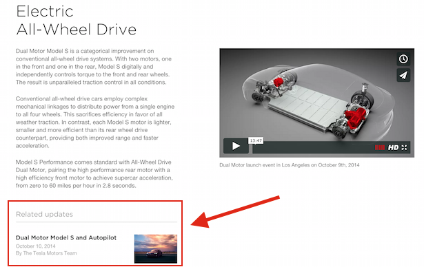
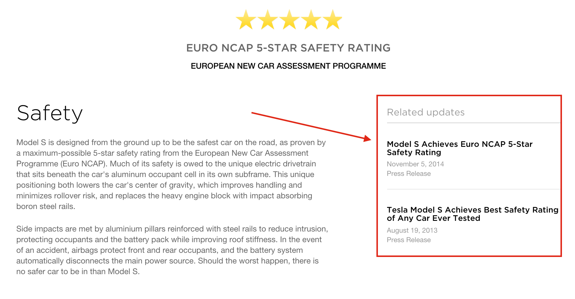
This idea of enticing readers into searching and reaching for more content to satisfy the curious customer helps improvement at Tesla (a company renowned for research and development).
Though a blog can sometimes feel like a superficial part of a website, Tesla use it for its full potential, to showcase information that isn’t digestible in other areas of the site.
SnapShot Video
We’re told time and time again that long videos are not engaged with, and it’s true unless you want a documentary. Instagram may have expanded to allow a minute of a video but 15 seconds is still the ideal result.
Tesla has 15-second videos of two of its smartest driving features (autopilot and auto-park) that neatly show off the functionality, making it cool but not boring or sales.
More of this is needed from traditional car manufacturers who may be tempted to simply re-purpose longer TV spots for their websites.
Autopilot — Autopark from Tesla Motors on Vimeo.
Have you got a Tesla? Why not let us know about the buying experience below.

