Make the Most of Your Menus
Posted on December 21, 2016 by James Duquenoy
Although often overlooked, a good menu plays a vital role in a website’s success. They’re used to pull users deeper into your site, help them find your content, and drive user engagement. Get it wrong and users won’t be able to find their way around your site. Follow these simple tips to improve your menus, offering a greater user experience and benefiting SEO.
“It doesn’t matter how good your website is if users can’t find their way around it.”
Best Practices
First and foremost, a website menu system should be clear, simple and concise. It should require minimal effort to use and understand, and should not intrude on your page’s content. A good menu will help users get to where they want to be at first glance.
Another vital aspect of a menu is orientation – users need to know where they are on your site in relation to your other pages. For example, having a different style for the active menu link or even a system of breadcrumbs will give context to your menu and help clarify your site’s structure.
Consistency is also extremely important. A different menu layout or design across multiple pages is extremely confusing and will make it much harder for users to navigate your site.
Concision and Ease of Use
You’ve probably come across a site with a huge, complicated menu that seems to contain an endless list of pages. As you probably noticed, such a bloated menu doesn’t provide a good user experience. Long lists of nested information creates complexity issues and are hard to navigate, which could ultimately discourage users from navigating deeper into your site.
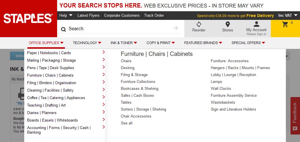
For example, although Staples’ menu looks fairly simple to start of with, expanding the dropdown reveals a fairly complicated menu structure containing over 180 links to interior product pages. Such a complex menu could end up confusing users, who may resort to searching or just give up and look for a product elsewhere.
A clean, concise menu layout should point to your top level pages in order to drive users to the most important and relevant areas of your site. This results in a clean, usable menu that is easy to understand and doesn’t overwhelm users with information.
Improved user experience isn’t the only benefit of a concise menu – cleaning up your navigation can also have a positive effect on SEO. Any authority passed from your high-ranking homepage will become diluted if shared between a long list of pages in your menu, which will ultimately decrease your site’s search rankings. The more concise your navigation, the more authority will flow to your most important interior pages – making them more likely to rank well in search engines.
Relevance and Clarity
All links in your menu should be relevant to your website and clearly explain what they’re pointing to, without including too much technical jargon. It’s also worth avoiding some of the generic menu link names, such as “products” or “services”. Since users aren’t really searching for these terms, including more relevant alternatives to the generic links in your menu will help boost your search ranking and make it easier for users to find what they’re looking for.
Similarly, confusing or misleading menu content will badly damage your site’s user experience, making it much harder to navigate your site. This poor user experience will result in decreased traffic to your website – as frustrated users will be more likely to leave your site in favour of a competitor with better UX, and having pages which are difficult to find will ultimately damage your search ranking.
Orientation and Consistency
There’s nothing more confusing than browsing around a website only to find the menu doesn’t clearly show which page you’re on. If you find yourself deep within the interior pages of a website, having a reminder where you currently are in relation to other pages of the website is extremely useful. Always be sure to have a different menu style to show which menu link is “active” (i.e. the page the user is currenly on) in order to provide vital orientation to users, helping to clarify your site’s structure.
Similarly, it’s extremely important to keep your menu design and structure consistent across every page of your site. Changing which links feature in the menu or changing the design across multiple pages will do nothing but frustrate users and damage your site’s user experience. Without consistency, your site’s structure becomes difficult to understand and users will quickly become confused.
Managing Menus in a CMS
Website menus are sometimes confusing to set up and awkward to manage in content management sytems, especially if you operate a large site with a lot of content. Fortunately, Web-Feet’s own Coaster CMS makes creating good, user friendly menus a breeze – both for site administrators and developers creating themes. Coaster’s drag-and-drop interface makes it very easy to manage your site’s menu and ensure it is optimised to give users the best experience possible.
Have a read of Coaster’s documentation to learn how to manage menus in Coaster or read our developer documentation for information about how to add menus to a Coaster theme. If you’d like to talk to us directly about improving your site’s menu, contact Web-Feet today.


