Lead generation forms, strategies to increase conversion rates.
Posted on May 18, 2016 by Jay Jones
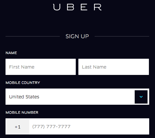
Lead generation forms sit at one of the most critical points in your marketing funnel – the point at which a visitor can become a lead.
Because of this, forms have an unhealthy amount of influence on your marketing results. When you double the conversion rate of your form, you double the effectiveness of every single traffic source, marketing channel, and campaign that relies on it. And despite the importance forms have, we rarely give them the attention they deserve.
Below are some strategies you can use to take your forms to the next level.
What is a lead generation form?
The forms on your website could make or break the conversion funnel you’re trying to setup for your business. A lead generation form is a place on your website that is the last stop before a visitor converts into a prospect for your business. This form could help a visitor become a subscriber to your email list, grant access to premium content like a white paper, help a prospect get in touch with your business and more.
Now, let’s get into how to make it amazing.
Simplify your forms by reducing clicks-to-complete.
When Microsoft released Windows Vista, fewer people shut down their PCs. Why? It turns out that Microsoft updated its shutdown command from a button to a drop-down box. This trivial change meant that users now had to click three times to shut their computer down instead of once.
This small amount of additional effort led to a significant decrease in people using the feature.

While there are no right or wrong question field types to use, it’s good practice to use field types that minimise the number of clicks-to-completion. Clickable image/icon buttons, like the ones in the Microsoft example in the top left, the image, are one of the most efficient form elements to use.
Not only do they only require one click to answer, they also provide the user with visual prompts. The fewer clicks required to complete your form, the fewer brain cycles and cognitive load (i.e. ‘thinking’) is required for your users to complete it.
In other words, the less your users have to think to complete your form, the better. As a rule of thumb, I’ve found reducing the number of ‘clicks-to-completion’ to be a good technique for improving the simplicity and completion time of forms.
Focus on motivation & outcomes
People use forms to achieve an outcome. The outcome your users are trying to achieve has a large impact on your conversion rate. After all, if you gave everyone a free Ferrari for using your form – you would likely have a near-100% conversion rate. While this is an exaggerated example, it illustrates how the performance of your form is influenced not only by the form itself – but by the promise of what lies on the other side of it.
By clearly communicating the benefits of using your form you can increase the user’s desire to complete it.

This is a common tactic used by dating websites. WeLoveDates shows a photo of a happy couple placed next to the lead capture form.
As the users of this website are likely to be looking for a relationship this image represents the outcome that they’re hoping for, and as a result increases their motivation to join.
First impressions count
The first impression that your form creates helps visitors decide whether or not the outcome is worth their time and effort in filling out your form.
So, first impressions matter. A lot.
When we changed the lead capture form on the BrokerNotes homepage from a dropdown question box to a full-page clickable image select box, we saw a 212% increase in people using the lead capture form. In addition to simplifying the questions, we tested adding large amounts of social proof and text to manage the visitors’ expectations (e.g. indicating they’re on step one of two).
All of this led to an improved first impression that converted over 46% of visitors.

One of the best tips for improving the first impression that your form creates is to split it into multiple steps (if you’re currently using a single-step form).
When designed well, multi-step forms appear less overwhelming and have been repeatedly shown to convert better than single-step forms.
Use physiological biases to your advantage
Cognitive biases are proven ways in which the brain makes illogical decisions. They can be thought of as ‘mental shortcuts’, such as jumping to the conclusion that a restaurant with a queue outside must be good. For example, it’s proven that people overvalue things that they play a part in building (known as the ‘IKEA effect’).
There are hundreds of these cognitive biases, which you can use to your advantage to improve your form’s performance. One application of this that can improve form completion is using a bias called the endowed progress effect. This bias proved that people are more likely to complete something if there is an illusion that progress has already been made.
Here’s an example of the endowed progress effect in use. In this form, the progress bar starts one-third complete, subtly indicating that by seeing the first step you’ve already made progress.
Because of this illusion of progress, users are more likely to go on to the second and third steps.

Don’t be afraid to make forms visual
The old adage says that a picture paints 1,000 words. Scientifically, this isn’t far from the truth. Our brains process images significantly faster than text. In fact, recent research from MIT found that the brain can identify images seen for as little as 13 milliseconds!
Images have an inherent advantage over text. Yet, most forms don’t use them. One of my favourite examples of a visual form is TopTal.com.
TopTal could say “we keep your Skype details private”, but instead it places a subtle padlock icon in the ‘Skype username’ field implying that this will be kept private and secure. TopTal could use text in the dropdown question box, like most other forms.
But instead, it uses recognisable colourful icons that make it easier to process the range of options.


Images also make a form appear more engaging and less form-like. From research studying high-converting forms, I’ve found that these kinds of forms, which appear more like ‘tools’ or ‘quizzes’, typically convert best.
Where to start?
Form optimisation can be overwhelming. With so many opportunities and elements to test, it can be difficult knowing where to start. If you’re not sure where to begin, I’d suggest using the Form Optimisation Pyramid as a framework.
Start at the bottom by brainstorming everything that can be done to increase the motivation your users have to use your form. For example, you might want to test using strong imagery or different copy to communicate why people should use your form.

From here you can move on to brainstorming ways to improve the user’s ability to use the form. Is your form accessible to people who are colour blind? Is it easy to use on a mobile device in bright light? What about for users who like to navigate through forms using the tab key?
Once your form passes this phase, you can then focus on ideas to improve the user’s peace of mind, ease of using your form, and how engaging your form is to complete. Most form optimisation advice focuses on usability and ease of use.
Using the framework above will ensure that you first take a few steps back to consider the underlying motivation driving your form conversions and whether or not your visitors have the ability to convert.
Let us know your comments below.
Credit to Econsultancy.

