Top 10 features of successful website development
Posted on November 21, 2018 by Cathrin Rhind-Tutt
Posted on November 21, 2018 by Cathrin Rhind-Tutt
Posted on March 21, 2018 by Dominika

What is Website Development Process?
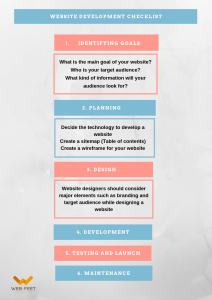
Website development is a comprehensive process that consists of essential steps that need to be followed. There isn’t a specific number of steps as it may vary depending on an agency or a developer, however, the basic process is pretty much the same.
We like to make things as clear as possible. Somebody who’s new to working alongside a digital agency may particularly struggle to understand the language developers speak. What terms will you come across while working with the web agency? We’ve created a cheat sheet with the terms that are used the most, so go ahead and download our cheat sheet!

Just like any other project, the very first step of developing a website is gathering all the necessary information. All the expectations you have from a website need to be clarified at the beginning of the project otherwise the whole project might set off in the wrong direction.

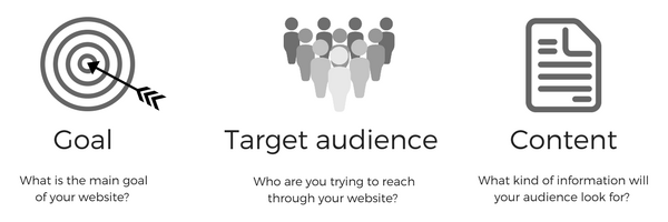
These are some of the aspects that need to be considered. The website’s purpose, goal, target audience and the information provided on a website will have a huge impact on what technologies will be implemented and what functionality the website will benefit from at the final stage. What is the goal of developing this site? Is it to drive more sales, create brand awareness or sell products directly from a website? The website whose purpose is to sell cars will have different functionality than the one specifically designed to inform. And the design of the website will reflect the type of audience.
Bear in mind, it’s very important that everything is agreed at the early stages of the project. Any changes that have not been agreed will require an increase in timeline and budget.
How do you plan a website development?
At the planning stage, we decide what kind of technologies will we use for developing a site, e.g. what CMS will be used and also, we give you an idea of how the website will look. We create a sitemap for the website which is then followed by creating a wireframe. The major difference between these two is:
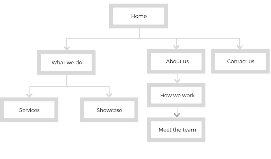
Sitemap represents a relationship between the main areas of the website and its content. A sitemap could be referred to as a table of contents for a website, showing off the future site’s navigation. While creating a sitemap, we have to consider things like; how easy will it be for an end user to find a piece of information he’s looking for from the main page? Or how easy will be to navigate the site? Keeping the end user in the heart of the process, we aim to plan a site that will be as user-friendly as possible.
Example of a sitemap for a simple website:

The wireframe gives you a better understanding of what the website will look like visually. Although there are no actual visual elements used (no pictures, no logos, no colours, etc.), it gives you an idea of what will be the layout of the website. It will show where on a page will we display text, photos, etc. Once you are happy with the layout of the pages we have presented, we can move on to the next stage – designing the website.
Example of using pen and paper: (The wireframe doesn’t have to be done in any expensive software, the layout of the page can be simply drawn on a piece of paper)

This stage allows designers to show off what they’re great at. The possibilities to design a fantastic looking website are endless.
What should be kept in mind when designing a website?
Target audience
Who will be using the site? A website aimed to target young teenagers will (and should!) look completely different from the one that’s offering financial support to businesses.
Branding
All the branding elements (logos, colour, font) have to be in place with the current branding.
Designing and developing a new website is not only about the way the website looks as there are many other important elements like functionality, speed, etc. However, it is important because the website represents your brand. It creates a perception in customers’ minds about the brand, having an impact on whether they will decide to use your products/services or not.
Keeping these important elements in mind, we start with designing the whole website (what to you might look like a ‘ready to go’ website, however, at this stage the website is not functional – it is just a proof of the design). Once you are happy with the design and ready to sing it off, we can move the proof across to our developers who will start to develop the actual site.
How is Web Development done?
And if you wonder how is web development done, here’s how it begins – after goal setting, planning and designing. The proof of the design we’ve seen in the previous stage will turn into a fully functional website which will be ready to go live very soon. The development process involves the programming work as well as loading content onto the site.
The sitemap we have created in the planning stage will help us actually build the site. We’d usually start with a home page and add all the subpages afterwards. From the technical point of view, in the development process we make all the elements of the website work properly, e.g. contact forms, payment gateways or functionality that were agreed earlier are being developed at this stage.
Once we build a site, we load all the content onto the site. Either a member of our team will do so, or you might prefer to do it yourself – whichever is more suitable.
Once a site has been built, there’s one more crucial step to be taken before the site goes live – testing. The reason for testing the site is to find if there are any issues, e.g. broken links that need to be fixed. Everything on a site should be tested – all the links, all the forms, all the scripts, even the content. It’s always better to fix the issue before we launch the site, rather than to launch a site that doesn’t work properly!
Once your site has been tested, we upload it to a live server and we are ready for the most exciting step of the development process – launch!
Once we launch the website, remember – it is not a product or service that once delivered, our job ends there. Websites need to be looked after and maintained the whole time they’re in use, e.g. with security updates to keep the site fully secure. If you use a CMS system, you want to do regular updates in order to prevent the site from any bugs, etc.
A great way to keep the site well maintained is a maintenance pot. We’ve been offering this service to our customers for many years and from our own experience, it is one of the easiest and most effective ways to keep the sites we’ve built up to date. We offer our customers a maintenance pot that they can top up anytime they like (with no expiry date). So once you wish to make any changes to the website or your website needs some updates, we simply take the time off from your maintenance pot – assuring you only pay for the actual time it takes us to do the job.
BONUS
Grab this Website Development Process as a PDF.

Posted on October 5, 2017 by Cathrin Rhind-Tutt
Magento 2 is the latest version of the most popular ecommerce platform in the world. Currently holding 14% of the market share for ecommerce platforms, it’s safe to say the Magento upgrade has been a pretty big deal for ecommerce businesses.
The key defining feature of Magento 1 is it’s flexibility. Users can create stores with a variety of functions using pre-made extensions or by utilising the coding skills of their developers. This flexibility leads to a better shopping experience, with plenty of useful features and innovation opportunities for both B2B and B2C businesses. This is one of the key reasons why Magento is so popular.
However, despite this flexibility, Magento 1 is not the most user-friendly platform. It lacks performance optimisation, mobile-responsiveness, and some admin capabilities that every online store needs. These essential features aren’t part of the Magento 1 package and would need to be developed by a skilled Magento developer. There have also been many complaints of Magento 1 running slow, which isn’t ideal for an ecommerce site.
To address these issues, the Magento team designed an upgraded platform: Magento 2.
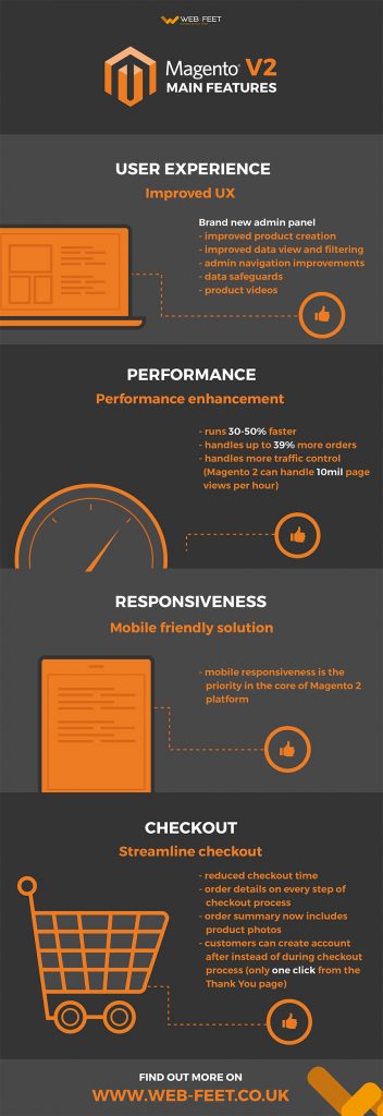
Magento 2 comes with features that make it a better platform overall. The major changes for Magento 2 include the following:

The admin panel of Magento 1 is notoriously difficult to navigate and not user friendly. Thankfully, the team at Magento decided to address this issue head on with Magento 2.
One of the most obvious changes and welcomed to the second edition of Magento is its brand new admin panel. The new admin interface is designed to help reduce the time managing the online store. It’s a lot more user-friendly and easier to get to grips with.
Magento 2’s administrative improvements and new capabilities include:
The admin interface of Magento 2 also now includes drag-and-drop layout editing, meaning users don’t need extensive coding knowledge to modify an online store’s appearance. This means you can create a beautiful online store in half the time.
The majority of Magento 1 stores had to alter the checkout process in some way to make it more user-friendly. Now, better checkout options are built into Magento 2. This means every store built with Magento 2 will by default have a more intuitive checkout process.
The checkout process in Magento 2 is more streamlined, making it quicker and easier for customers to go from adding items to their cart to completing an order. It’s highly customisable and requires fewer complicated steps and customer information. Reducing the checkout time is huge for reducing abandoned carts and increasing conversions, so this is a great improvement for both customers and business owners.
Magento have also simplified customer registration by allowing customers to create an account after ordering instead of during the checkout process. When a customer goes to checkout, they are brought to a default guest checkout screen where they enter an email address. If this matches an existing customer, they are given an option to checkout faster with saved information. Guests can create an account in one click from the order Thank You page. These features which simplify the order process encourage customers to return to your site and make purchases. Fewer confusing choices and fewer forms means a significant increase in conversions as customers focus on what matters: finishing the checkout process.
The new checkout also includes order details on every step, offering greater transparency to help put your customers at ease. The order summary in Magento 2 now includes product photos. This reduces ordering errors which cuts down on returns and increases buyer confidence that leads to higher conversions.

As more and more customers are shopping on smartphones and tablets, mobile responsiveness is key to improving sales. In fact, 50% of online transactions are now performed on mobile devices. The Magento team recognised this and made mobile responsiveness a priority for Magento 2.
Magento 2 comes with new responsively designed and SEO-friendly themes, integrated video features and a streamlined checkout. These all improve the look and function of Magento stores on mobile devices, thus encouraging mobile sales. A much more streamlined, mobile-friendly checkout and faster performance will result in a much higher conversion rate for your mobile shoppers.
The new admin panel is also responsive and touch-screen friendly so you can manage your store on the go. This enhancement ensures easier control and configuration of the online store. This is great for merchants who work with their CMS via iPads or tablets – make changes in the office, on the train or at home.
Magento 2 was designed with performance in mind. The developers behind Magento have achieved this through utilising the following technical improvements:
Magento 2 will run an average of 30% to 50% faster than it’s predecessor. Faster site speed encourages more user interaction with your site and more products added to your site’s cart, leading to more sales and fewer abandoned carts.
The latest Magento version can handle up to 39% more orders per hours with 66% faster add-to-cart times that Magento 1. It can also better handle many catalogue pages without slowing down, with a nearly instant server response time for catalogue browsing.
Magento 2’s improved functionality also means it can handle more traffic. Magento 2 can manage 10 million page views an hour, whereas Magento 1 can only process 200,000. This makes it ideal for large stores and able to grow with an online business.
In addition to all of these fantastic new features, updates within Magento 2 are designed to work a lot quicker, making it easy for Magento users to take advantage of new features as they’re released.
As we’ve mentioned, Magento 2 integrates a lot of popular extensions so stores have better functionality out of the box. This includes payment gateways like PayPal and Braintree. These are payment platforms the majority of Magento users choose to integrate anyway, so having them already integrated into Magento 2 makes it a lot easier for store owners.
Magento 2’s integration with PayPal means customers do not need to re-enter payment information such as a billing address as this is handled by PayPal, another development which makes the checkout process smoother and quicker.
There are also integrations with Worldpay and Cybersource to increase payment security, so customers can rest assured that their payments are safe and secure.
Web-Feet have certified Magento developers who are eager and ready to help ease this transition. Let us help give your customers the benefit of Magento 2’s new features.
Although some have reservations about moving to Magento 2, it’s clear this platform was designed to provide a better experience for both customers, store owners and administrators. It maintains the flexibility Magento is known for, but with improved features.
What’s more, soon Magento 1 security updates will be stopping, so all Magento ecommerce site owners will have to move over to Magento 2 sooner or later.
If you’re thinking about moving your ecommerce site over to Magento 2, or creating one from scratch our team of expert Magento developers are here to help.
Posted on April 21, 2017 by Cathrin Rhind-Tutt
We all ❤ emojis.
Whether they’re used in texts tweets or adding a bit of magic to our Instagram posts, emojis are everybody’s favourite messaging trend. According to the Telegraph, they’re the fastest growing language in history in the UK.
Their growth in popularity is driven by our love for emojis and the emotions they evoke.
But beyond their novelty purposes, can emojis help mobile marketers engage with users?
Posted on April 11, 2017 by Cathrin Rhind-Tutt
Google has been gradually shifting its various services straight into its search results for easy access. Google has now introduced its dedicated URL submission feature, which can be found directly in the core Google search results page.
The tech giant has updated Search to include an easy-to-access URL submission form, which can easily be found anytime you search for ‘Submit URL to Google.’
This latest addition works just like the regular Search Console submission form but enables easier and quicker URL submission to Google’s index. It’s a smart interactive tool that’s been placed in the most convenient location.
To submit a link, all you need to do is fill in the blank space with you page you want to index and complete the ‘I’m not a robot’ reCAPTCHA safety feature.
Google will then review the page and decide whether they want to index the URL so other people can easily find it in their search results. This doesn’t necessarily mean your URL will be listed or included in Google’s rankings, but it makes getting noticed by Google that little bit easier.
Posted on March 24, 2017 by Cathrin Rhind-Tutt
One of the most powerful weapons in business is graphic design.
An poorly designed website can look boring, amateurish and downright ugly. The solution? Graphic design – a redesign of your website and brand image that will propel your business into the modern day.
Posted on March 13, 2017 by James Duquenoy
Google’s reCAPTCHA service has helped to weed out fake traffic (which costs advertisers billions every year) and stop bots from maliciously submitting forms on the internet for years. However, the awkward letters and numbers were often difficult to read and could even deter users from completing a form. Google’s latest version of reCAPTCHA is now completely invisible to users, and instead works in the background to automatically detect if someone is a human or a bot.
Posted on January 22, 2017 by James Duquenoy
Google is implementing a series of changes to Chrome, the world’s most popular web browser, to try and make the web a safer place. Starting in January 2017, Chrome will display a warning when a page isn’t protected by an SSL Certificate. Further down the line, Google plans to show this warning for all HTTP pages.
Posted on September 28, 2016 by Taylor
Apple Pay for eCommerce websites is here. This month sees the release of macOS Sierra and iOS 10, bringing with it many new features. The most interesting, in our opinion, being the availability of Apple Pay on the web. This opens an interesting new dimension to online shopping and eCommerce. Customers can now order items with the touch of a button by using Touch ID on their iPhone, iPad or Apple Watch. This presents a great opportunity for shop owners that use an eCommerce platform.
Posted on July 8, 2016 by James Duquenoy
With the competition for visibility in search engine results getting more intense than ever, Pay-Per-Click (PPC) advertising is a fantastic way to get the edge over your competitors. If done properly, it will drive more traffic to your site and boost your revenue. If you’re unsure whether PPC is right for your business, we’ve outlined five reasons that explain why it is definitely worth the investment.


