Web Design Archives -

The Website Design Process: A 10 Step Guide

Posted on April 3, 2019 by

website design meeting

Following on from our popular article – The Website Development Process: A 6 Step Guide, we thought we’d cover the Website Design Process in a bit more detail.

Collect ideas

There will be a strong temptation to dive right in and start designing things for your client so that you can demonstrate you are keen to progress the project. Resist this temptation and take some time out to collect some outline ideas of what it is you are trying to achieve. Ask your client if they have collected ideas on what sort of design layout and feel they want for their new website design. Do they want a clean professional look, something cool and funky, something more functional with a specific layout or search features or specific filters for e-commerce etc. Ask your client if they have seen other sites that they liked, and also disliked. This will give you a good idea of the sort of website design to aim for.

Logo design (if required)

Your client may already have a logo for their brand or business, in which case you can skip this step. If they do have an existing logo then you will want to incorporate the ‘feel’ of this into their design. You will of course also need to know the colours that are being used in the logo. You can use these as a basis on which to allow the colours to flow nicely throughout the rest of the website. Brand is really important so the new design should focus strongly on your clients brand.

Home page mock up

First of all you will want to design some static mock ups in Photoshop (or similar) and share these with your client. Focus only on the home page at this point because until you’ve nailed this aspect of the design there is little point spending time on any other internal page mock ups – unless you are very sure you’ve likely nailed it already. It’s worth setting up a sub domain of your own website to show off your mock ups, such as client.domain.com/client1 – this is a nice professional way of sharing your ideas. As your web design work will not be responsive or interactive at this point, be sure to let your client know otherwise they may not be too impressed!

Once your client is happy with their new design, make sure you have a formal sign off process. Nobody likes to talk about money but as a designer, time is your business and how you earn money. So any future changes are going to take you a lot of time to go back and rework so just make this clear to your client so you know where you both stand.

Internal page mock up

With the home page design signed off you can move on to designing your internal pages. There may be a number of different templates to design but they may follow the same look and feel. Focus on the key layout or layouts and present these to your client for sign off and approval before moving the project on.

Category page (e-commerce)

If you are working on an e-commerce project such as Magento for example, you will want to create some Category Page mock ups. You should already have a wireframe or sitemap to work through from the pre design stage of the project so you will know what category pages you are designing. This is where layout and functionality come into play with your web design work. You are now having to balance design flare with good UI and page layout first and foremost. Take some products or product details from your client and mock up the category page for your client and this will help steer your web development team once the design is cut up and wrapped around your chosen e-commerce platform. Again, ensure you have a formal sign off with your client.

website design product page

Products page (e-commerce)

This is the next level down the stack in terms of e-commerce web design. Your product pages need to look nice, be functional and have great UI. Think about your favourite e-commerce websites and how they are designed and presented to the user. Be sure to take any product variations into account and how these might be presented to the user in a nice clean interface. Don’t forget to get it signed off….

Check out page (if non standard)

Not the final, final step in e-commerce design but a critical part of it anyway. The e-commerce check out is leaning the most towards function rather than design but it still needs to follow brand. In fact, this is really important as you want a clear association with your brand throughout the entire website design process. As this is where your website user is parting with their money, you want to make sure they are still enjoying the experience through well thought out UI and page layout. You know what I’m going to say…. client sign off!

Contact page design

An often overlooked part of a website but probably one of the most important, especially if you are using funnels or just want to encourage website users to get in touch – which you should! This page needs to be clear, easy to use and understand – especially important if there are lots of options. It should of course represent your brand so make sure that is featured. I guess what I’m saying is don’t skimp on design for your contact page. It’s likely to be one of the busier pages on a website so make sure it does your client and your website design justice!

Rest of pages signed off

With everything taken into consideration in the points above, make sure any other pages your are designing are part of your workflow and sign off process. Stay organised with your website design process and reap the rewards of smooth workflow and happy satisfied clients.

Designs cut up and project moves to development

Now all your designs and templates are signed off, you can hand the project over to your web development or e-commerce team to cut up the design and wrap them around your chosen CMS or e-commerce platform.

Web-Feet are a Digital Marketing Agency near Southampton in Hampshire in the UK. We specialise in Coaster CMS website design and development. Our e-commerce platform of choice is Magento and we can offer a full suite of Digital Marketing services. We specialise in actionable, data driven SEO practices to ensure we deliver results based on real data and not guesswork. If you want to get in touch to discuss any of our services, please do. If you enjoyed this post please feel free to share it and leave comments below. Thanks for reading.


How to clear your browser cache

Posted on December 5, 2018 by

When you browse the Internet, with a computer or mobile device, your browser puts a small file for easy connection in a cache folder. They contain information from the sites you visit. These files can become a handicap if the authors of the sites change the presentation of their pages. At worst, a corrupted file can even prevent the download of the page. To fix these issues, empty the cache folder of your browser which may include any of the following: Chrome, Firefox, Edge, Internet Explorer, or Safari.

Clear cache from Google Chrome

Desktop

  • Open your Google Chrome browser. The logo is a red, yellow and green diaphragm with a blue circle.

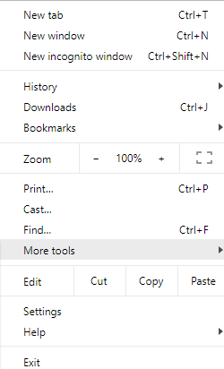
  • Click the three dots. The button is located in the upper right area of the screen. A drop-down menu will show up.

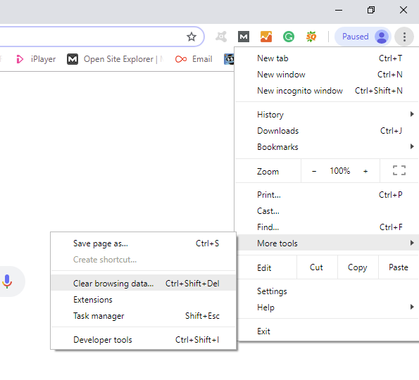
  • Click More tools. This option is in the fourth part of the menu. A pop-up menu appears on the left.

  • Click Clear browsing data. This is the second option at the top of the menu. A selection window will appear on the screen.

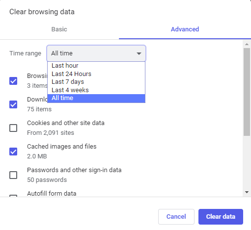
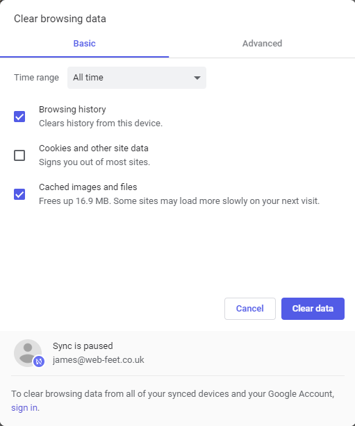
  • Choose a time interval. Pull down the Time range list. To be sure to completely erase cache data, choose All time. Otherwise, you can sort the data by choosing, for example, Last hour.

  • Check the Cached images and files check box. This is the last box of the window. If this box is already checked, go to the next step. You can of course uncheck the other navigation elements if you only want to empty the cache folder.

  • Click CLEAR DATA. This is a blue button at the bottom right of the window. Chrome’s cache folder is now empty of any data.

Mobile

  • Open your Google Chrome browser. Touch the Chrome icon, which is a red, yellow, and green diaphragm with a blue circle.

  • Touch the three dots. The button is found in the lower right part of the screen. A drop-down menu will come out.

  • Touch on History. This option is found in the drop-down menu.


  • Touch Clear browsing data. The tab is in the lower left area of the screen. In Android, this option is almost at the top of the screen.

  • Tap on Cached Images and Files. In doing so, you display a blue check mark. If the blue checkmark is already present, proceed to the next step. Uncheck the other navigation items if you only want to empty the cache folder.

  • Touch Clear browsing data. The button is seen at the bottom of the screen. In Android, you can press Clear Browsing Data.

Clear cache from Firefox

Desktop

  • Open your Firefox browser. Its logo is a blue globe whose lower part is occupied by a red fox.

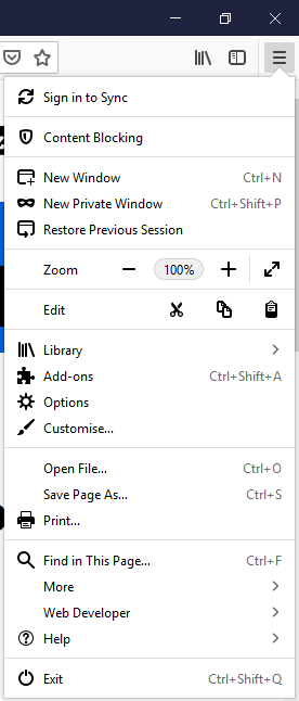
  • Click on three dashes. The button is in the upper right corner of the window. A drop-down menu will appear.

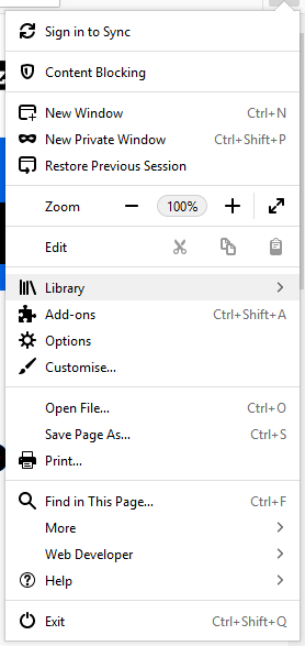
  • Click Library. This option is in the fifth section of the drop-down menu.

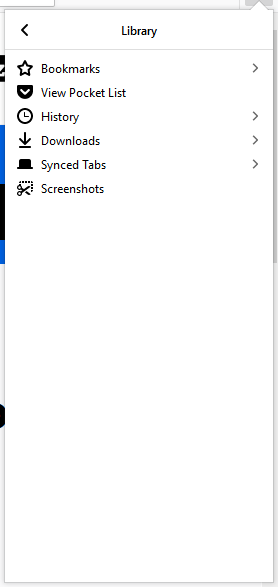
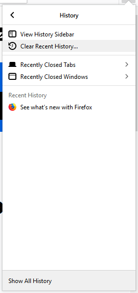
  • Click on History. This is the third proposition of this menu, represented by a watch.

  • Click Clear recent history. The button is almost at the top of the menu. In this window, you will find the mention of the cache, but also other elements.

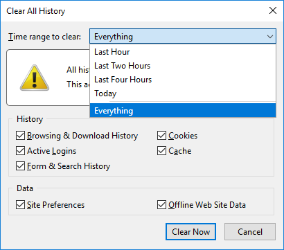
  • Select a time interval. Click the Time range to clear drop-down list, and find and click Everything on the menu. Depending on your needs, you can choose another time interval, for example Today.

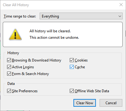
  • Check the Cache box. Simply click on the small empty square to the left of the caption. If this box is already checked, go to the next step. If you only want to clear the cache, uncheck all the other boxes in the ‘ Details ‘ section.

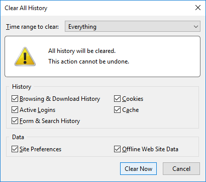
  • Click Clear now. The button is at the down part of the window. The Firefox cache folder is now empty.

Mobile

  • Open your Firefox browser. Touch the Firefox icon, which is a blue globe whose lower part is occupied by a red fox.
  • Touch the three dashes. The button is in the lower right corner of the screen. A menu will appear. In Android, tap in the upper right corner of the screen.
  • Touch Settings. It is on the right side of the menu that appeared.
  • Scroll down and touch Clear my tracks. It’s in the Privacy section that you will find this button. In Android, Erase My Traces is in the middle of the screen.
  • Touch the white slider labelled Cache. This slider is roughly in the middle of the page. If you touch it, it will change colour, the cache folder is ready to be emptied. If the cursor is already blue, go to the next step. With an Android device, you must check the Cache box. If you only want to clear the cache, disable the other blue cursors so that they appear in white.
  • Touch Clear my tracks. The button is at the bottom of the screen. In Android, tap Clear my tracks at the bottom of the screen.
  • Touch OK at the desired time. The cache folder of your Firefox browser is now empty. This step does not exist in Android: it is automatic.

Clear cache from Microsoft Edge

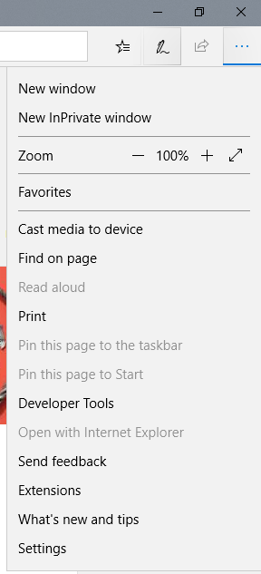
  • Open your Microsoft Edge browser. Its icon is the lowercase letter “e” in dark blue.

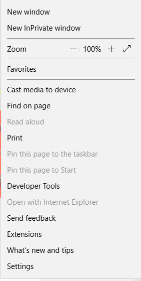
  • Click on the three dots. The button is in the upper right corner of the window. A pop-up menu appears on the screen.

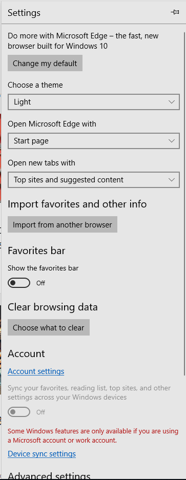
  • Click Settings. This option is at the bottom of the context menu.

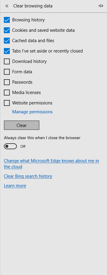
  • Click Choose what to clear. This option is right under Clear Browsing Data. Scroll down to see the option in question.

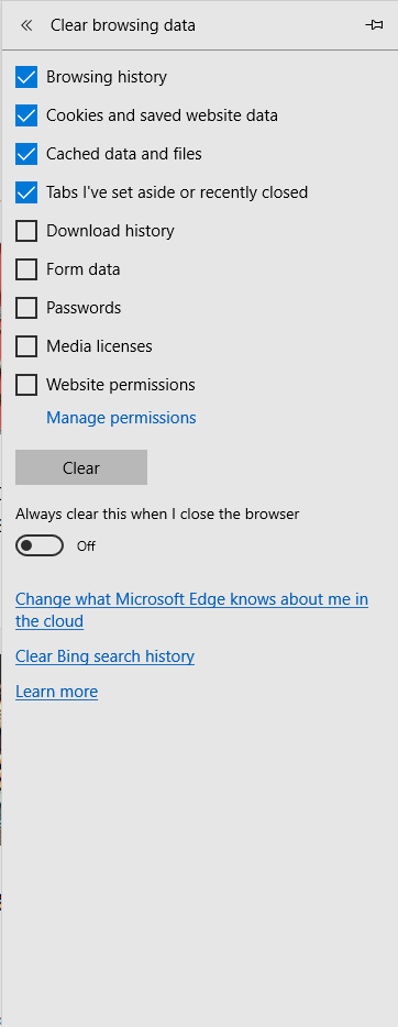
  • Select the Cached data and files. It’s about in the middle of the list that you have in front of you. If this box is already checked, go to the next step. If you only want to clear the cache, uncheck all other boxes in the list.

  • Click Clear. The button is about in the middle of the menu. In doing so, you will empty the Edge cache of its contents.

Clear cache from Internet Explorer

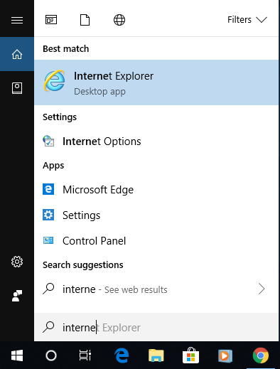
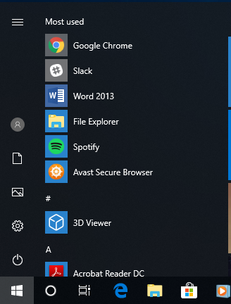
  • Open your Internet Explorer browser. Its logo is a light blue “e” with a sort of yellow comet wrapped around it.

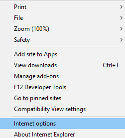
  • Click on the gear icon. This is in the upper right corner of the window. A drop-down menu will appear.

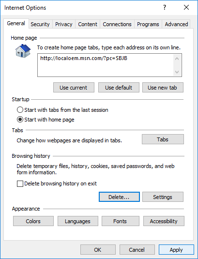
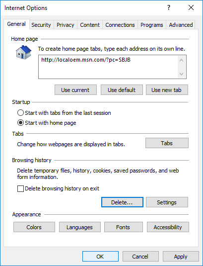
  • Click Internet Options. This option is at the very bottom of the drop-down menu.

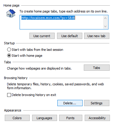
  • Click on Delete. The button is on the right side of the Internet Options window, in the Browsing History section. If you do not see this, first click the General tab at the top of the Internet Options window.

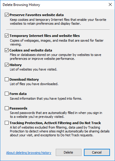
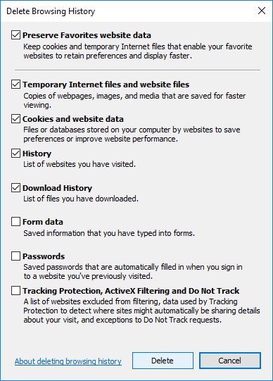
  • Check the boxes in the cache. The two Temporary Internet files and website files and Cookies and Website Data boxes must be checked. If these two consecutive boxes are already checked, you have nothing to do, it’s perfect. If you want to empty only the cache folder, you can uncheck all other boxes on the page.

  • Click on Delete. This button is at the bottom of the window. Doing so will remove the contents of the Internet Explorer cache folder.

  • Click Apply, and then click OK. These two buttons are at the bottom of the page displayed on the screen. In doing so, you save the changes made and exit the Internet Options window.

Clear cache from Safari

Desktop

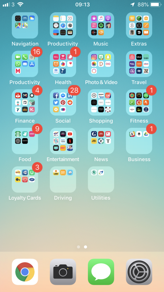
  • Open your Safari browser. In the Dock of your Mac, you will find its icon: it is a blue compass with a white and red needle.
  • Click Safari. You will find this menu, written in bold, to the left of the menu bar. A drop-down menu will appear.
  • Click Preferences. This is the third option of the Safari menu. Logically, the preferences window is displayed on the screen.
  • Click the Advanced tab. This option is at the far right of the preferences window.
  • Tick the right box. Check the Show Development Menu box in the menu bar at the very bottom of the Preferences window.
  • Close the preferences window. Check at the top of your screen that the Development menu appears in the general menu bar.
  • Click on the Development menu. This is at the top of the screen. A drop-down menu should appear.
  • Click Empty Caches. Look for its location roughly in the middle of the drop-down menu. You will have to confirm your order. To do this, click Empty Caches or OK (or any other formula of this type).

Mobile

  • Access the settings of your iPhone. They are represented on the home screen by a grey icon containing a gear. The settings page appears on the screen.

  • Scroll down and tap Safari.

  • Scroll down and touch Clear History and Site Data. This blue link is at the very bottom of the screen.

  • To finish, touch the red link Delete. The data in the Safari cache folder on your iPhone is deleted.

It is strongly recommended when you delete data on a browser to close the browser after the procedure and run it again to finalize the deletion. Removing the cache folder from a browser has nothing to do with removing cookies.

Once the cache is emptied, it is normal that access to the sites is a little slower: the browser starts loading data again.


Google’s reCAPTCHA is now Completely Invisible

Posted on March 13, 2017 by

Google’s reCAPTCHA service has helped to weed out fake traffic (which costs advertisers billions every year) and stop bots from maliciously submitting forms on the internet for years. However, the awkward letters and numbers were often difficult to read and could even deter users from completing a form. Google’s latest version of reCAPTCHA is now completely invisible to users, and instead works in the background to automatically detect if someone is a human or a bot.

Continue reading →


Time to review your customers’ experience?

Posted on February 16, 2017 by

Time to review your customers' experience
Is it time to review your customers’ experience?

If you are looking to build a better more profitable business, it pays to take some time out to review your customers’ experience – put yourselves in their shoes and see the experience they have. Here’s where to start;

How do your customers find you?

This applies to both existing and new customers. Existing customers behaviour is very much to use the internet to find your email, office address or just find other more specific information – most of the time they will do this without you knowing. New clients will do the same but are likely to be looking for more general information about products or services – they may also search for you by name but possibly also by product or service.
Continue reading →


Make the Most of Your Menus

Posted on December 21, 2016 by

Although often overlooked, a good menu plays a vital role in a website’s success. They’re used to pull users deeper into your site, help them find your content, and drive user engagement. Get it wrong and users won’t be able to find their way around your site. Follow these simple tips to improve your menus, offering a greater user experience and benefiting SEO.

Continue reading →


Why Does Your Site Need To Be Responsive?

Posted on October 2, 2016 by

There are now more mobile devices on Earth than there are people – and as almost 60% of all website traffic comes from these devices, it’s never been more important to make sure your site is designed and developed with mobiles in mind. A responsive design means your site can be used and enjoyed by users on any sized screen or device – which will not only give your users a better experience, but also boost your SEO.

Responsive

Continue reading →


6 Mistakes That Turn Mobile Customers Away

Posted on May 26, 2016 by

Think of the online customer as a spoilt child – and that child doesn’t like waiting. A delay in delivering a mobile friendly website causes them havoc, rushing away as if you have the plague – all this happens because of a few schoolboy errors.

The digital generation has no patience for disappointment in user experience. They want it now, they want it their way. We’ve identified six issues that are particularly annoying for mobile users, and any one of these mistakes could drive visitors away from your site.

6 Mistakes that Turn Mobile Customers Away

  1. Your website simply fails to load

Even the giants of American marketing sometimes fall short in the most basic ways, by making sites that entirely fail to appear on mobile devices. Although visibility into the mobile UX can be challenging ‒ especially when you factor in the sheer number of mobile devices and the slowness and inaccuracy of many mobile testing tools, it’s no excuse for making a site that doesn’t work at all on mobiles.

Doritos recently had a high profile campaign designed to leverage the excitement surrounding the Batman vs. Superman movie – but it didn’t go to plan, as it did not work at all on mobiles. Can anything be sadder than pouring buckets of money into a high-profile campaign, only to have it not appear? All that money created irritation, not excitement.

Tip: Make sure your website displays on all market-leading phones or tablets!

Continue reading →


Some of our happy customers

logo ahmad
logo poingdestres
logog swiss
logo ibhs 1
ww
logo sgc
logo nationwide
logo undersea
logo roughton
logo stcross
logo pulse
logo mm
logo jfl
logo heritage 1
logo firesafe
logo electrofreeze
logo clickmetal
logo baguetti
bpc
logo ccc 1
log arokah
logo labs
logo paragon
logo trant
logo nahh
logo edge
logo romsey
ace1
ace2
spaceway logo
logo bookharbour
logo chartco
logo cranbourne
logo magister
logo mgmetals
logo westway
logo ocean
logo testvalley
logo brittania
logo faac
recref
logo gss